Monier
With a passive-house standard, energy class A and a BREEAM-NOR classification of «VERY GOOD», Monier is one of the greenest office buildings in town.
TYPE OF PROJECT: Office
LOCATION: Skøyen, Oslo
CLIENT: Norwegian Property ASA
SIZE: 31 400 kvm BTA
TIMEFRAME: 2012 - 2015
STATUS FOR PROJECT: Completed 2015
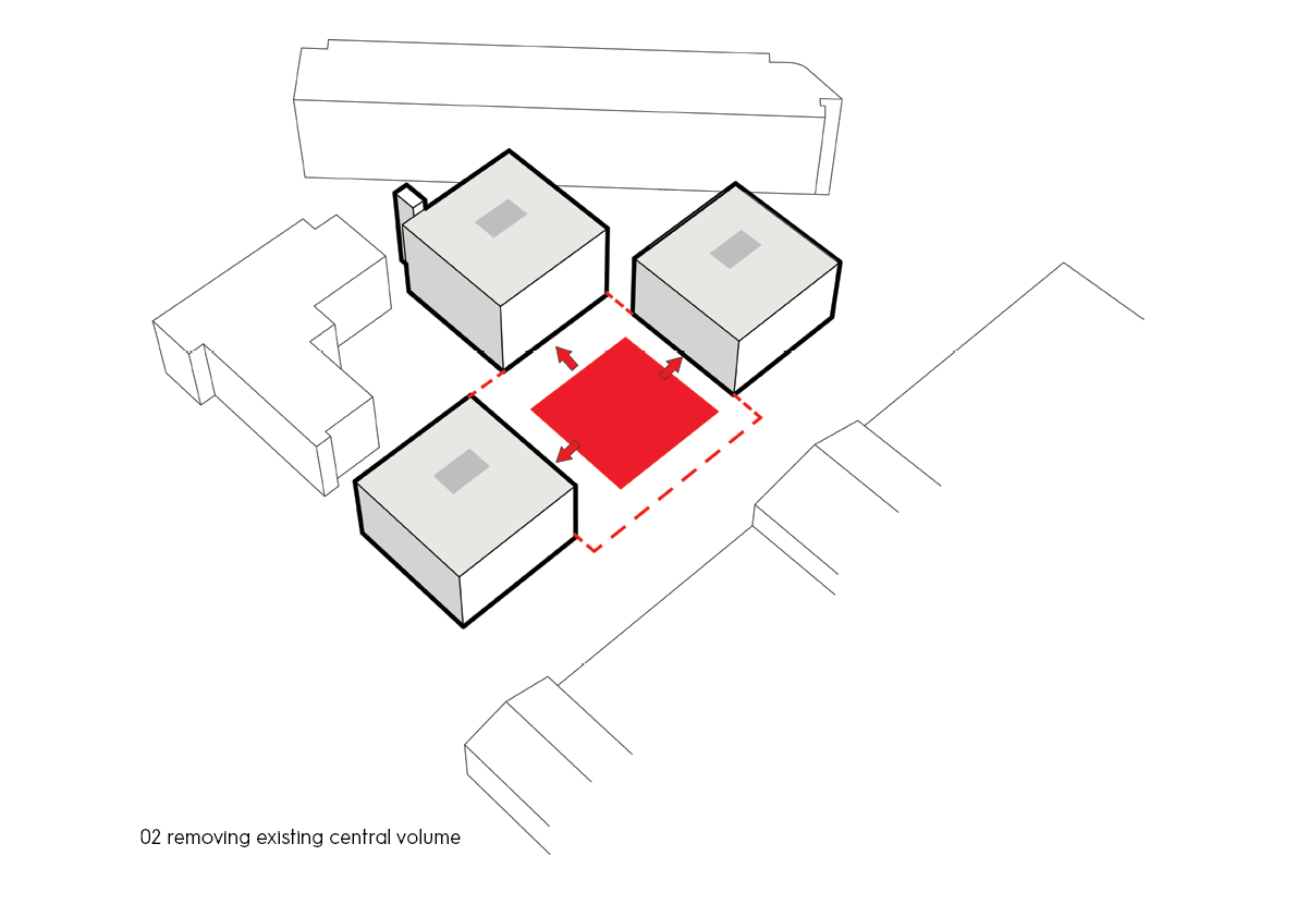
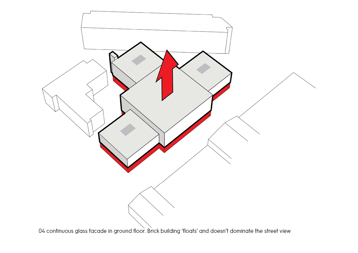
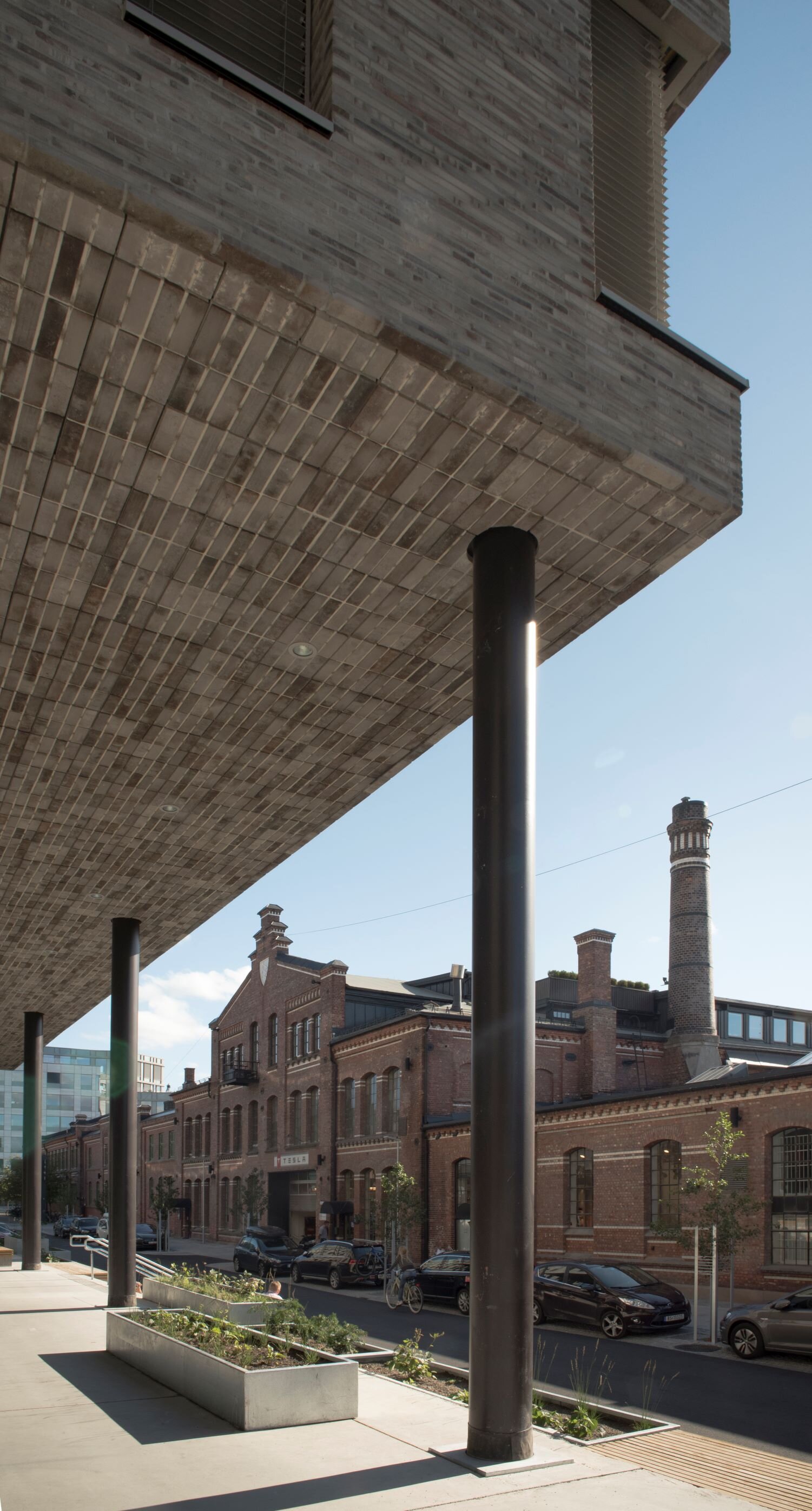
Designing Monier, the task was to create a sustainable office building on the former site of cement factory Oslo Monier- og Cementvarefabrikk in Skøyen. Repurposing the existing basement and foundation, as well as rationalizing four building volumes into one, reduced the energy consumption both in the construction phase and in the lifespan of the building. Its tile-clad façade is a nod to the building’s former life as a factory. By lifting the tile façade two stories up, the ground floor was converted into an arcade mall for shopping and food and drink, while the large glass panes make the building seem light and almost hovering.
Oslo Monier- og Cementvarefabrikk was established in 1895 and was the first concrete factory in the country. It supplied the water pipes for Oslo during the city expansion in the 1920s. In 1897, they established at Thune, and several of the former factory buildings are protected by the city’s agency of building heritage protection. In 1980, a modern office building was built on the site, as telecom company Telenor moved in.
Repurposing
When Norwegian Property purchased this 1980s building as well as three surrounding buildings in 2010, the general idea was to repurpose the existing bear loading system. However, because the concrete structure was braced, necessary structural changes were impossible to implement. Developers Skanska launched the idea of tearing down the building, but keeping the basement, which was carefully cast on site on a massive 90 meter rock bottom. The new building was constructed from prefabricated steel and concrete. Just by repurposing the foundation, the total energy consumption from the whole project was reduced by 20%, while the cost was reduced by 10%.
Space Efficient
What was formerly four separate buildings, were merged into one continuous building volume, increasing the total building mass by 50% and the floor space from 16 000 to 25 700 square meters. For a company, being able to house all of their employees in one building is an advantage. It becomes easier to get a grasp of all of the different branches of the company, and it gives a more coherent impression from the outside.
Façade
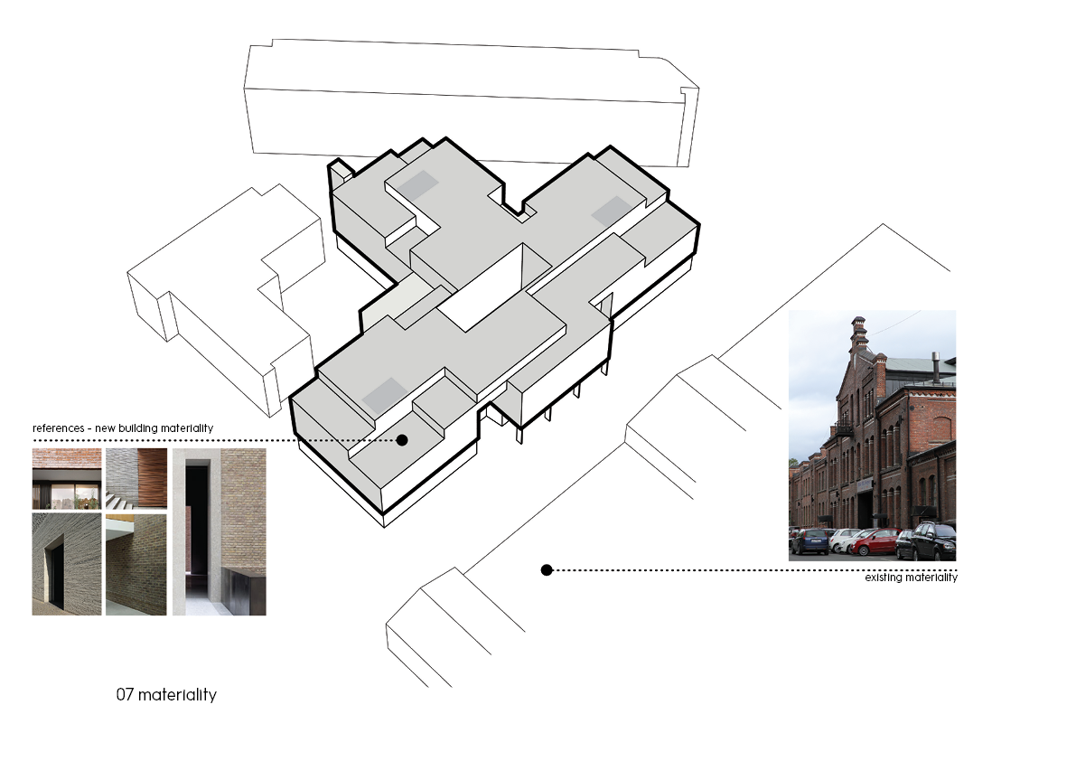
The building heritage protection agency demanded that the façade be clad in tile to establish a link to the old factory buildings. A warm, bright and grey tile with a long and more modern format than that of its adjacent buildings was chosen to create an age contrast. In addition, there was a requirement that the ground floor be used for business. An ingenious load bearing system was developed so that the tile façade could be lifted two stories up. The high ceiling ground floor was retracted in under the body of the building to give space to an arcade with a partially roofed passageway. The panoramic window base creates the illusion of a hovering building and gives the whole building a lightness despite being made of massive rock material.
Materiality
There was a desire to accentuate the monolithic and homogenous quality of the bricks both from the outside and the inside, which meant that the window frames would be crucial. A quality-oriented developer allowed the production of mock-ups of the windows to carefully craft the transition from brick to window. The window frame was to be covered by brick to further emphasize the monolithic expression. A process of experimentation on the window frames resulted in a 100% successful solution: The window frames look as if they are about half a meter deep. They are not, but the close proximity between the tiles and the glass creates the illusion of deep frames. The tiles retracted and become part of the interior – an architectonic feature that may not be obvious to everyone, but that is nonetheless present on an unconscious level.
Axis
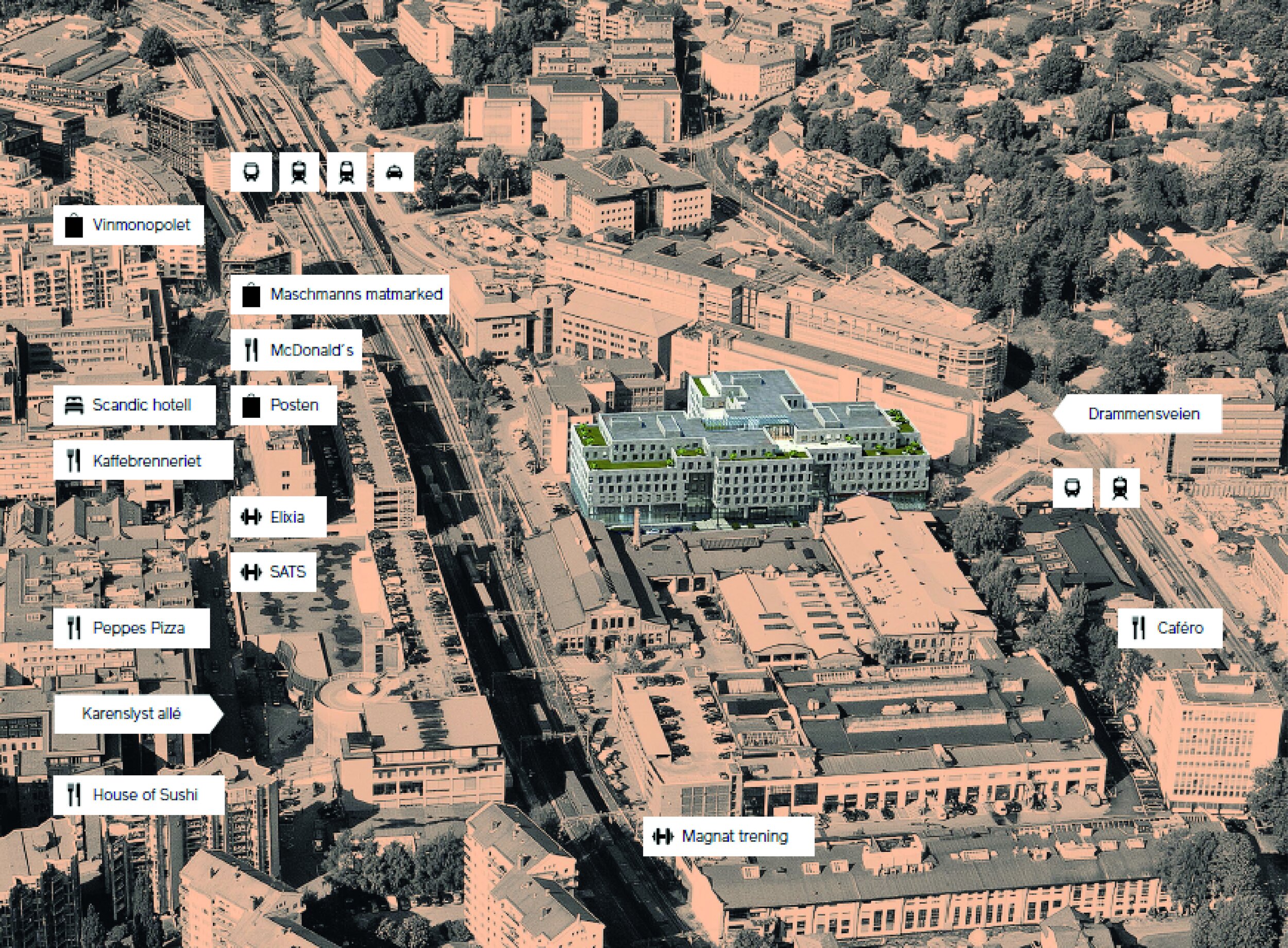
The Monier Building is the main element in a general move to give the area between Drammensveien and Karenslyst Allé an upgrade. This project further establishes the pedestrian route to Karenslyst Allé and Bygdøy, it revitalizes its neighborhood and contributes to a bustling urban environment in Thune. This street used to be for cars only. Left without a sidewalk or a bike lane, pedestrians and cyclists were in sort of a no man’s land. Instead of a normal sidewalk, a gallery with steps down from the ground floor was built. The gallery offers space of cafés and tables, and people can enjoy an informal homemade lunch and be social here. Tree planting was important for the atmosphere and to establish a link to the lush Frognerparken park.
Floor Plan
Flexibility was the overall mantra when the floor plan was designed. The architect and the interior designer from A-lab collaborated on creating working spaces that were technically satisfying in terms of visibility and views, but also in terms of internal movement, flexibility and peace to work. A rather simple but complex floor plan with 100% open landscape offices was designed. Compact buildings with a deep floor plan are ideal for creating great offices. With the ripple effect theory in mind, the most noisy functions were placed in the center, while the open landscape offices were placed along the walls.

Daylight
The old 1980s office buildings had extremely bad daylight conditions. In order to let daylight seep in, a shaft was put in where the building measures 60 meters across. Large window panes and terraces on multiple levels let the natural light seep in, and have reduced the need for artificial light. The bright floor surfaces are energy efficiently heated using modern solutions.

