Ski Towers
How to create secluded private outdoor spaces in a high-rise?
TYPE OF PROJECT: Residential
LOCATION: Ski, Norway
CLIENT: Solon Eiendom
COLLABORATORS: Dronninga Landskap, Multiconsult
SIZE: ca. 4500 m2 BRA
TIMEFRAME: 2017- 2022
PROJECT STATUS: Under construction
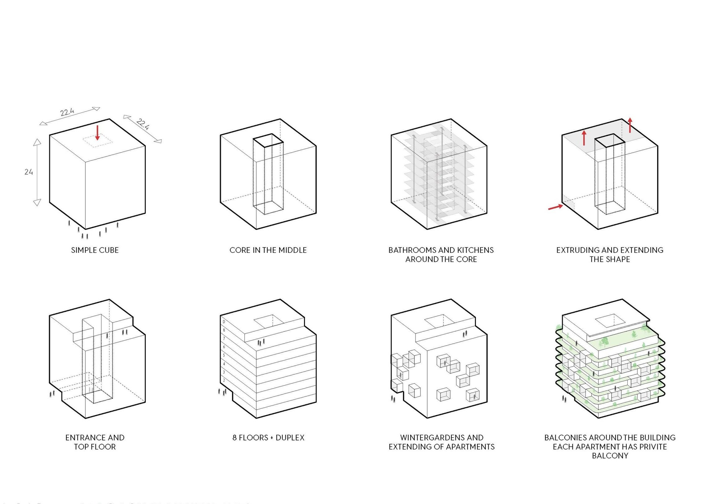
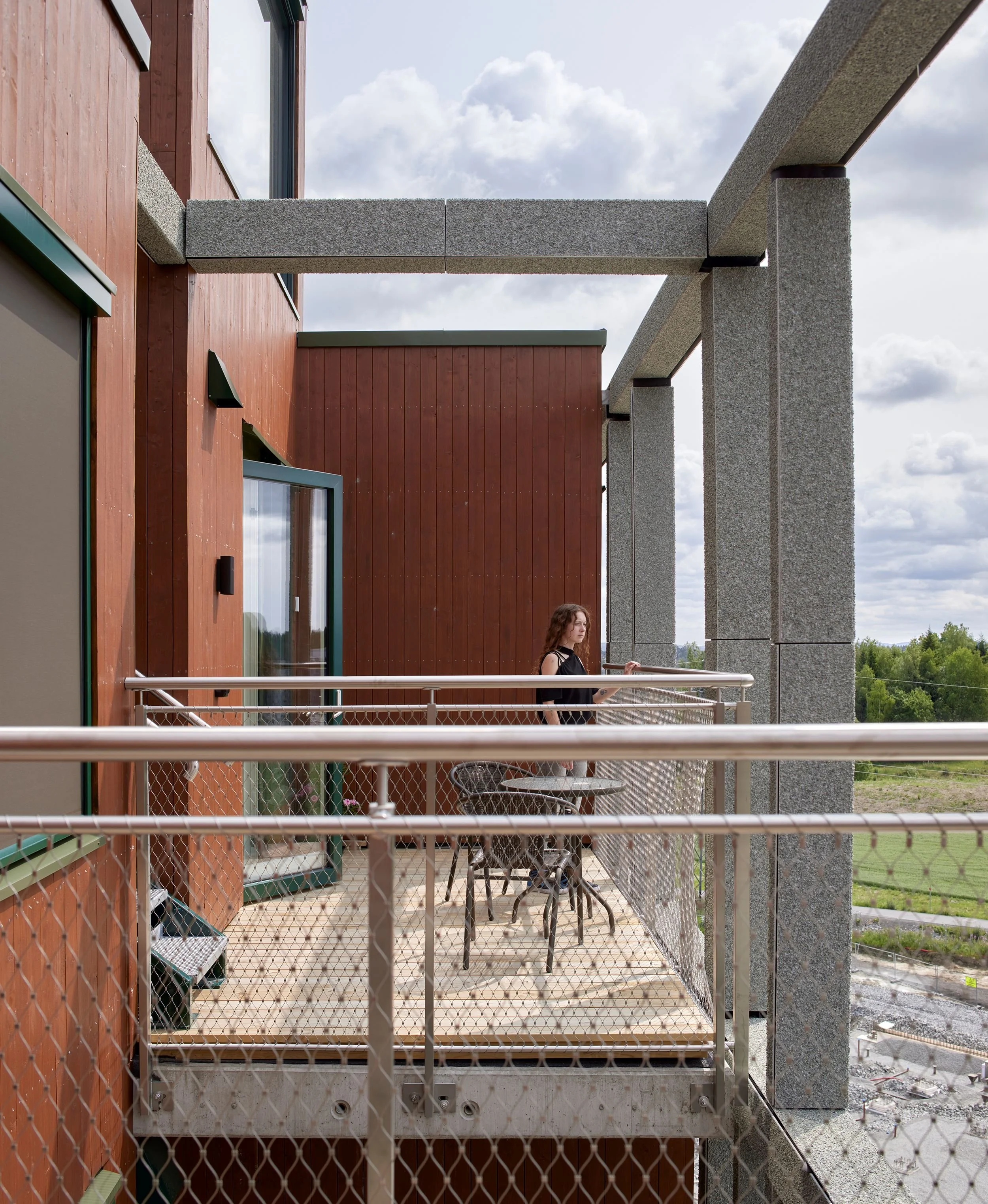
Ski Tower is one of four high-rises that will make up a new neighborhood called Magasinparken in Ski outside of Oslo. This building stands out because of its exterior framework that wraps around it and gives the structure an organic and mellow look with no obvious front- or backside. This exoskeleton allows a space between the façade and the framework where private balconies have been put in. The framework is made from crushed olivine, which has a natural ability of binding CO2 and cleansing the air. The seemingly asymmetrical composition of the framework is in itself a decorative element that prevents the inside of the apartments from being visible from the outside.
ORNAMENTATION. It was important for us to establish an interaction between the four high-rises on this plot. The rounded corners of Ski Tower gives off an organic look that contrasts the other three buildings, which all have a more angular design. The building is oriented in a way that optimizes the daylight conditions in each of the apartments. Since the framework wraps around the four exterior walls, the building has no clear front- or backside, rather it communicates equally well in each direction.
The floor plan accommodates six apartments on each floor, with the exception of the top floor, which has been allocated to four luxury apartments. The result is a substantial number of corner apartments. The grid has a seemingly random structure, with window niches popping out from each floor in an irregular pattern. These niches are placed in correspondence with the design of the different apartments to create interesting floor plans on the inside. In addition, they double up as vertical screens between the different common areas. None of the balconies have direct contact with the next door neighbor. They are separated either by a niche or by a generous space behind the framework. The result is an improved sense of privacy.
Dynamics
The big leaps in the façade, from the exterior walls with vertical wooden cladding to the crushed olivine framework, are a deliberate move. Olivine is a natural resource that have the ability to bind CO2. Hence, the outdoor areas are framed in a material that acts as a natural air-freshener. The natural green color of this material, together with the wood cladding, also bring an aesthetic quality that is further emphasized during spring and summer, when the building is wrapped in sprouting and blossoming plants.
Even if you live on the seventh floor and are lucky enough to have a balcony, you do not want people to be able to look in. The grid has the unique quality of creating a screen against the outside world while at the same time preserving a special intimacy behind it. This feeling of intimacy is further enhanced as the wood on the exterior walls creates a warm and embracing atmosphere.
Four light shafts pop up as aesthetic markers on the roof. The building is oriented towards the south-east. Thorough calculations proved that it was possible to get the afternoon sun to shine down on the dinner table in four of the apartments by giving the light shafts a slanting roof. These slanting roofs also prevent snow from piling up on the overhangs.
Sketch from the design process of the roof
The four top floor apartment are all corner apartments with balconies and private roof terraces. Exterior staircases lead up to the roof terraces from the balconies, freeing up interior space that would otherwise be used for staircases. In addition, a more direct contact between the top floor apartments and their roof terraces is established. The light shaft also double up as zone dividers between the private roof terraces.
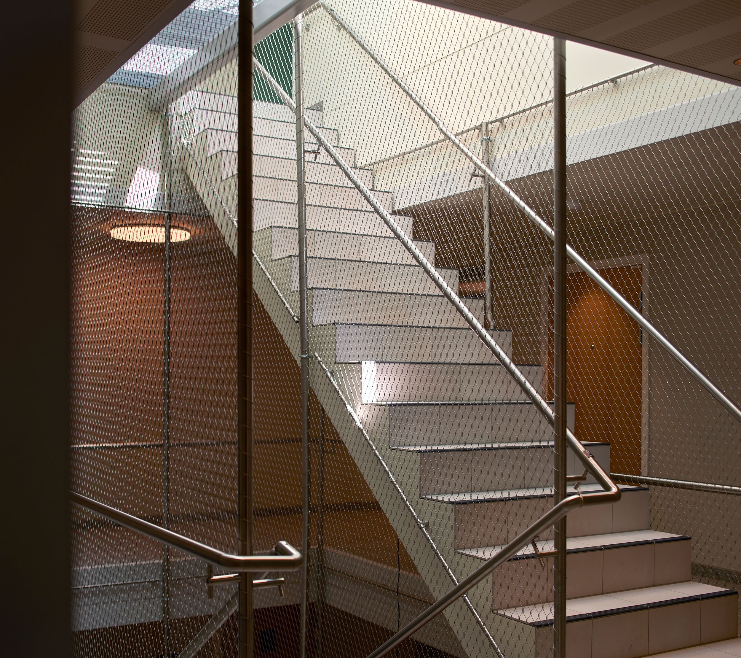
There was a desire to avoid the reflections that glass fences on balconies can give. Thanks to a quality-oriented client, using a railing of steel mesh of a particularly high quality was on the table. The meticulously interwoven steel mesh hangs down from the stainless steel pipes almost like hand knitted fishing nets. The elegant mesh lets the light and the view stream through and become part of the life on the inside. The same mesh railing has been used for the common pathways, where the curves from the corners are repeated in the transition from wall to roof.
Today, open kitchen and living room areas dominate in new buildings. By putting in bay windows, we have manage to create several room-inside-a-room solutions. This means that the living spaces all have different zones where you can have the feeling of being alone even when you are not. The balconies gives a more spacious feel and make it seem as if the indoor space reaches all of the way to the framework.
The top floor has only four apartments, while the other floors have six. One element that gives the apartments a feeling of luxury is the light shaft that let the sunlight shine down upon the kitchen and living room area.


