The Wedge
A beginning and a conclusion
TYPE OF PROJECT: Office
LOCATION: Skøyen, Oslo
CLIENT: Oslo S Utvikling AS (OSU)
COLLABORATORS: Dronninga landskap, Bjørbekk & Lindheim, Landskapsfabrikken
SIZE: ca. 4 000 m2
TIMEFRAME: 2009-2016
STATUS: Completed
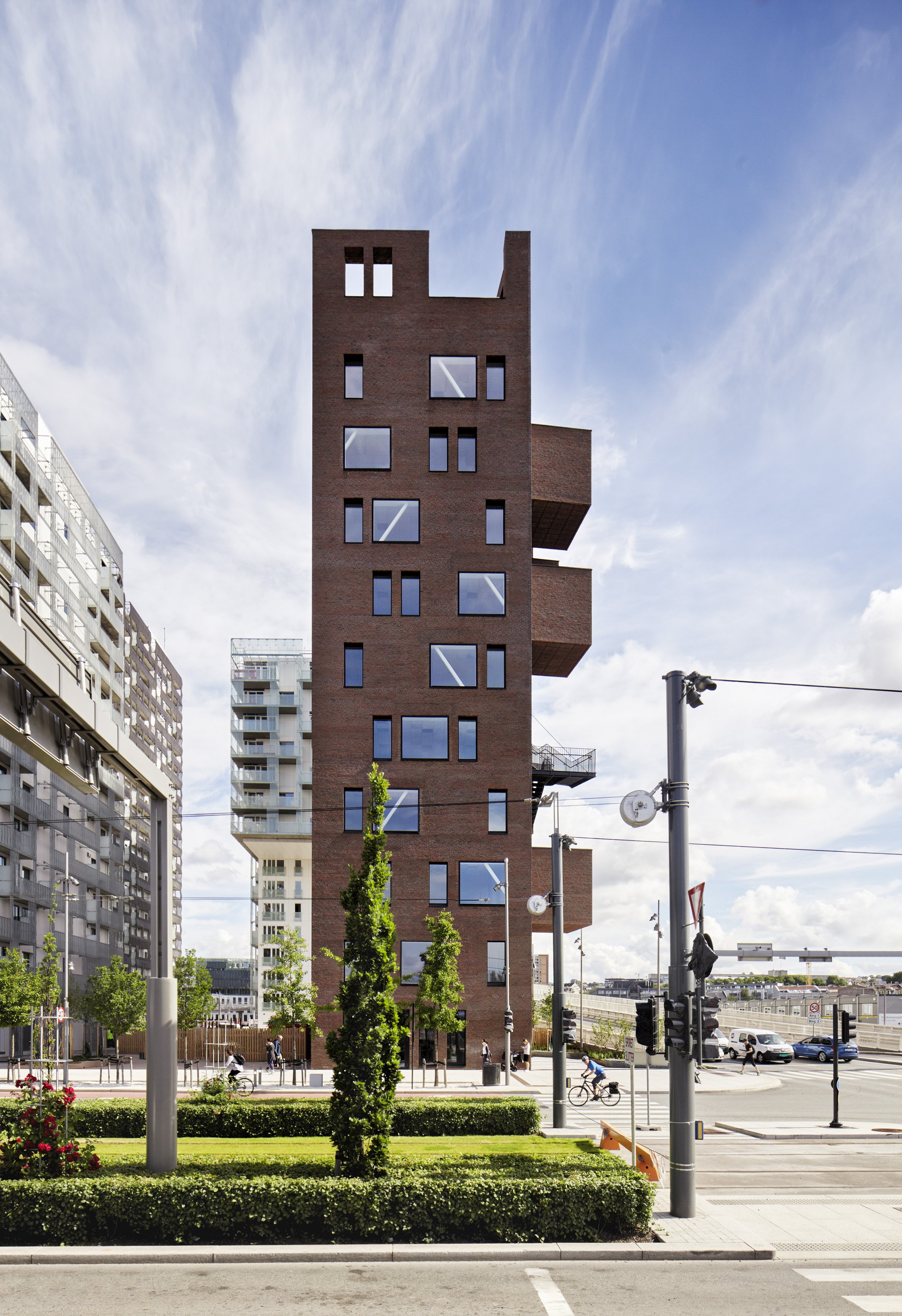
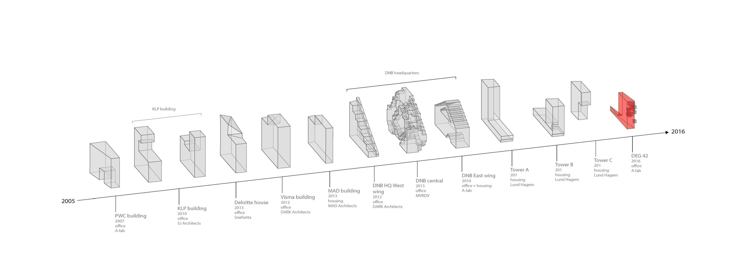
The Wedge constitutes the last and outermost of the 13 building-chain making out Barcode. When approaching the capital from the East, the structure rises in front of you like a modern interpretation of a medieval castle, strongly inspired by the classic Brownstones of New York. The slender building structure makes room for the possibility of smaller companies having a presence in Oslo's Business District as well as the larger ones.
This final site of the Barcode row was a narrow wedge between the building row and the main westbound route into Oslo. Was it too narrow and ineffective to be worth developing?
«What if we flip these challenges into advantages? Barcode had become a business district for large corporations. What if we do the opposite and make buildings that suit the undergrowth of smaller enterprises based around the city? All of these enterprises that supplement the large corporations, but nobody thinks about.»
Project leader of Barcode and founding partner of A-lab Geir Haaversen.
With this in mind, Haaversen and the rest of the A-lab team went on a field trip to New York, where one day, they took a break in The Meatpacking District.
«As I sat there gazing at the classic brownstones with exterior steel staircases, the kind we have seen in countless movies, the design of the last building suddenly became obvious to me. Why not build Oslo’s take on a brownstone to conclude the Barcode row?» Geir Haaversen says.
If The Wedge had been filled with the necessary facilities, it would not have been more than meeting rooms and emergency exits. An unexpected twist was to place the meeting rooms and the emergency exits on the outside.
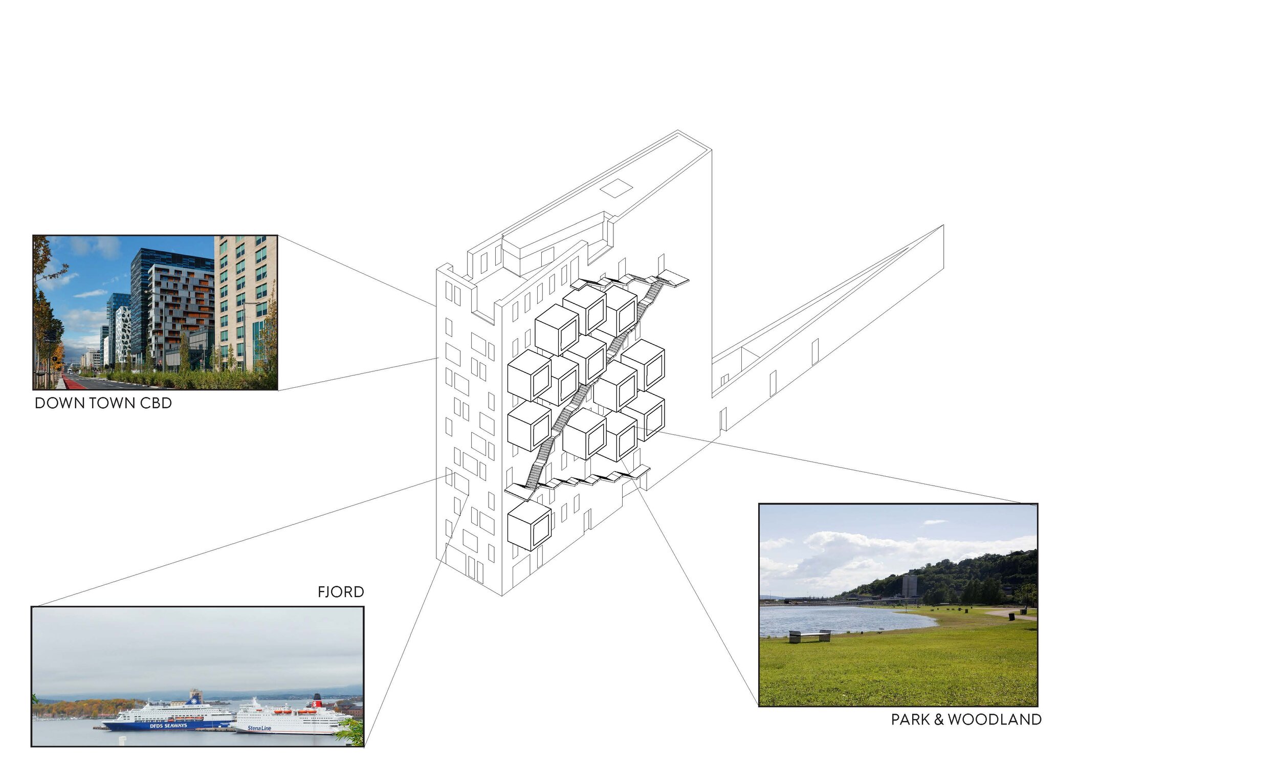
The advantage of being on the end of the row was that the eastern façade had a view of the Middelalderparken park. The meeting rooms were placed on the exterior, almost as if they had grown out of the wall. The famous New York style steel staircases function as emergency exits and balconies. Not only did these design measure free up space for the office areas, they also gave the building its iconic look. When arriving in Oslo from the east, The Wedge is the first building you see. The meeting rooms jut out from the façade, signaling that this is an active and happening city.
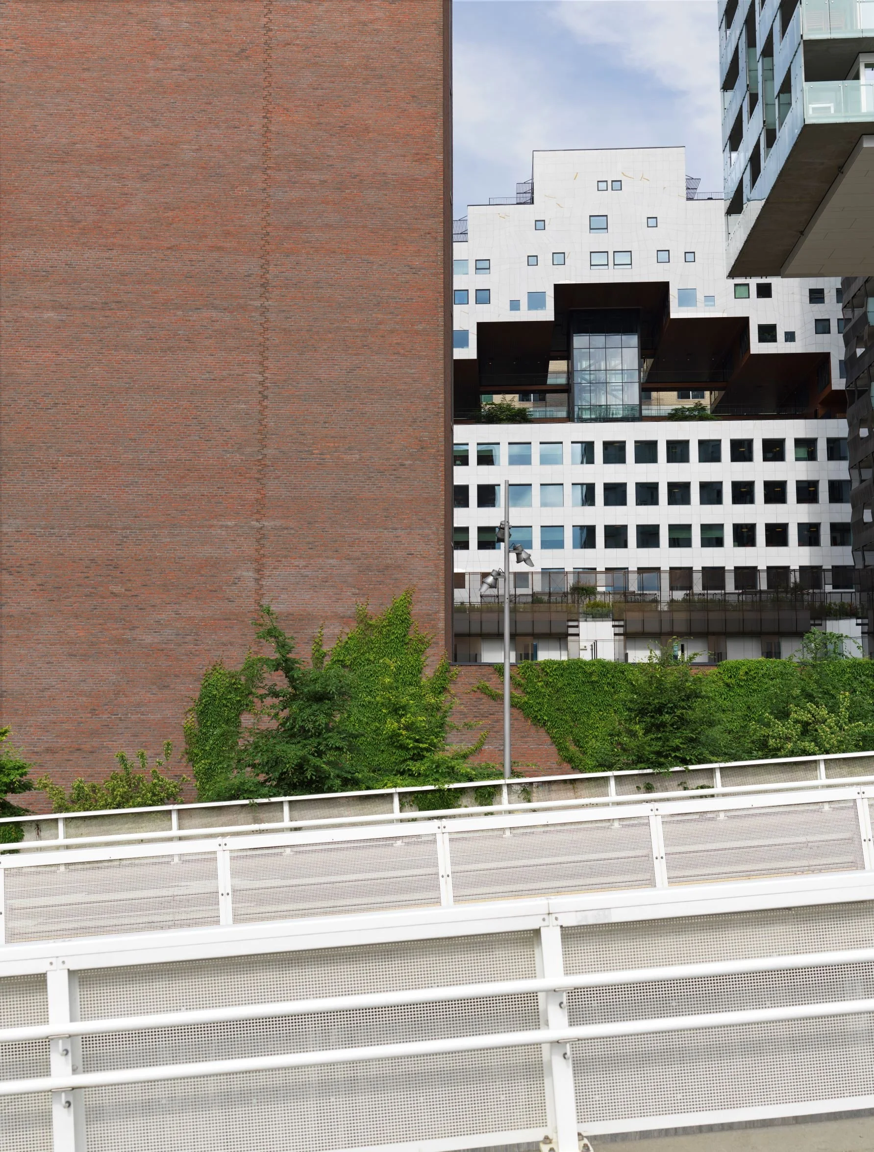
Brick was a deliberate choice of façade material. Not only does it contrast the rest of Barcode, it also establishes a link to earlier settlements in the Middelalderparken park.
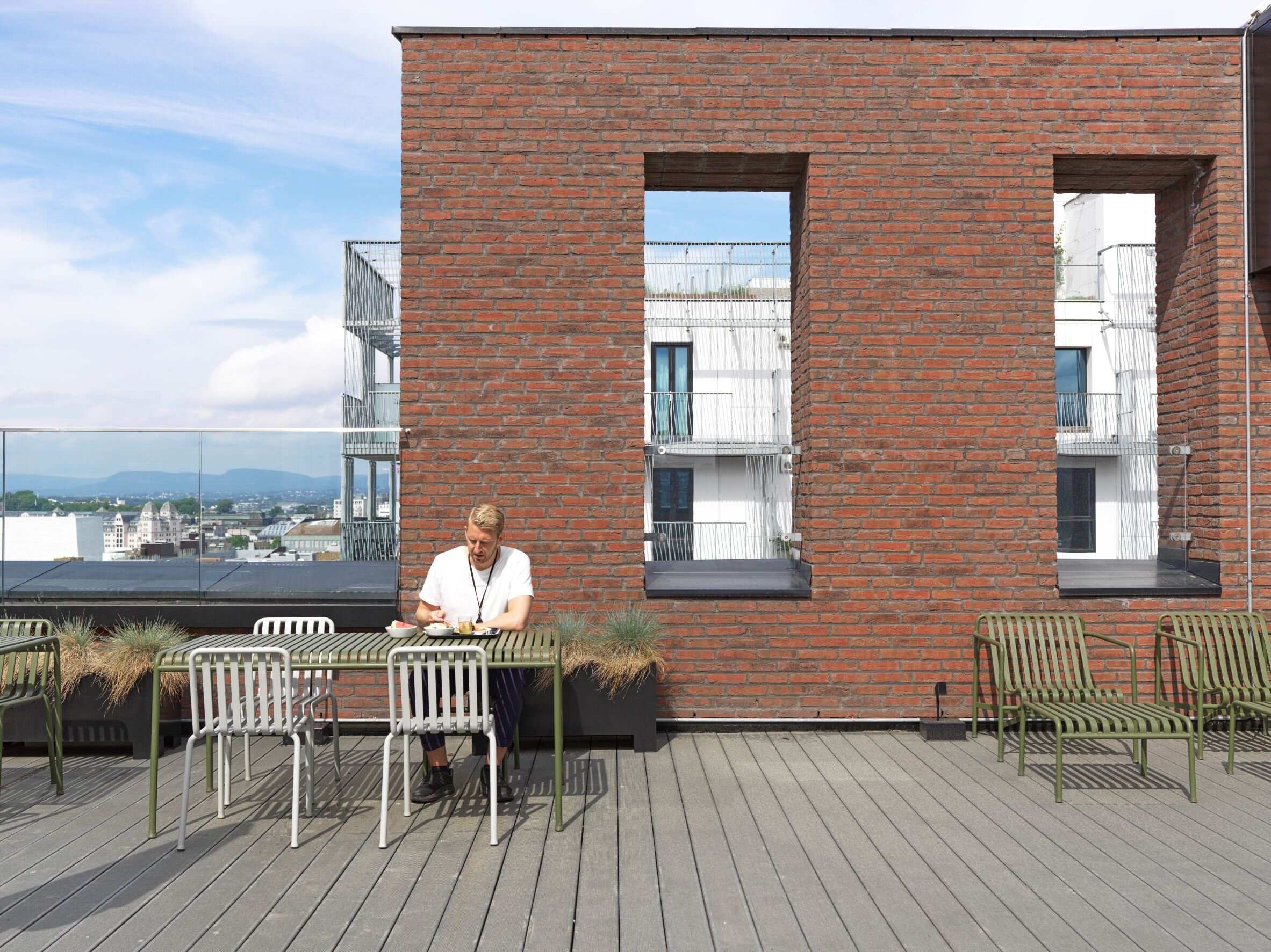
«I am very fond of the architecture of castles, and I have seen most of the castles in Europe. There is something special about standing at the top of a medieval castle, gazing out over the city, safely guarded behind its brick walls. For The Wedge, we made the walls protrude way over the rooftop. We did the same thing with the windows to create gaps that resemble arrow-slits,» Geir Haaversen explains.
As a result, the building features a spectacular roof terrace that is sheltered behind «arrow slits» and accommodates everything from social gatherings to private meetings. Sedum plants create a nice atmosphere and helps protect against storm water.
Tailored Interaction
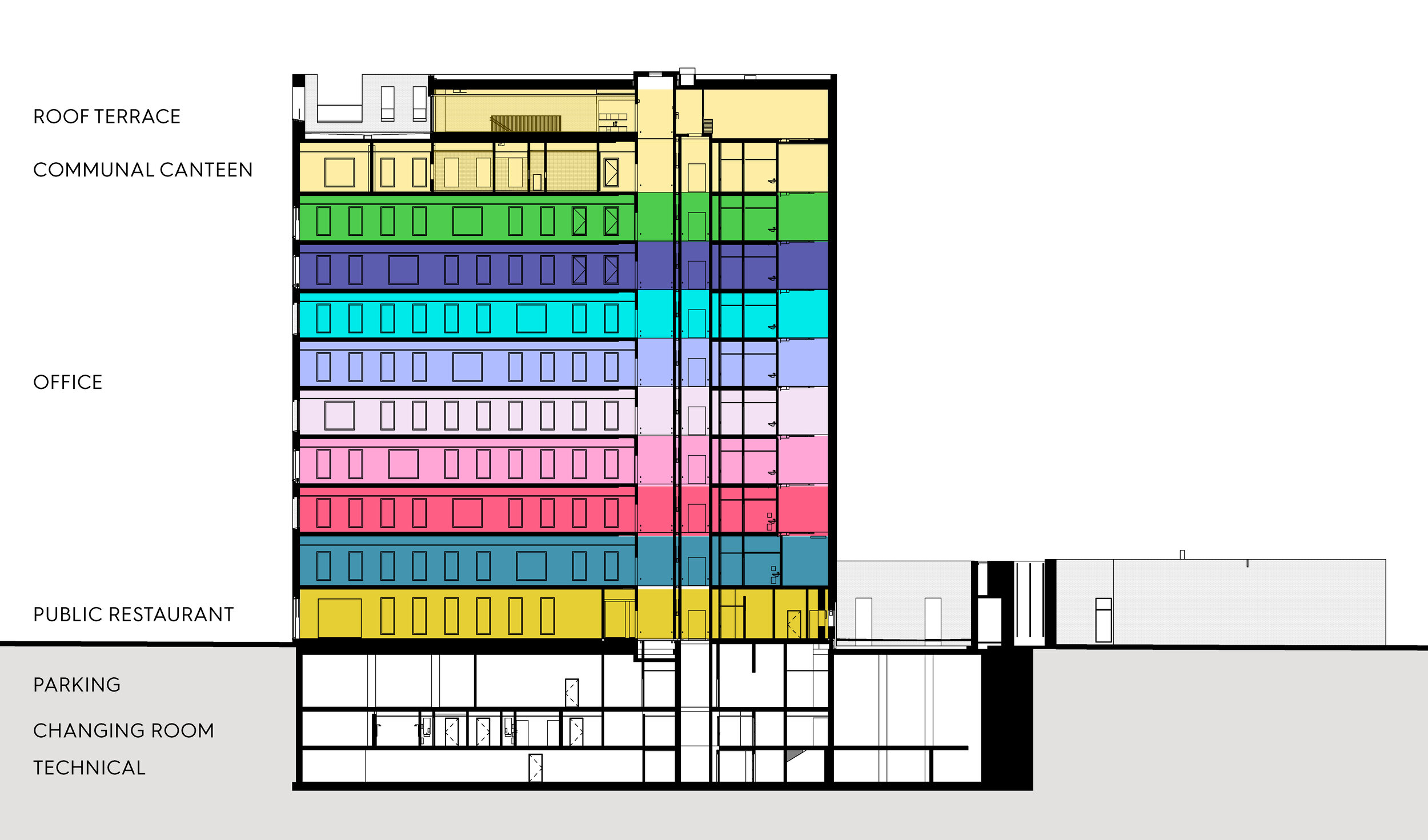
The office areas are tailored for smaller enterprises of 15–35 employees wanting to keep their employees on one floor. The floor plan reveals that the office areas are completely free of interior supports, allowing each company to furnish as they see fit. Functions such as elevator shafts and restrooms are placed in the narrow northern end of the building to free up space for the office areas. The windows in the eastern, western and southern facades let daylight in throughout the floors – an important measure in a country where wintertime only offers six to seven hours of daylight.
The southern façade features panoramic floor-to-ceiling windows that connect the interior to its surroundings. The cafeteria has deliberately been placed on the tenth floor, with direct access to the roof terrace. The spectacular view from the upper floors adds qualities rarely offered to smaller companies, and this area is the building’s most important social hub. Each floor is served by the two elevators were chance meetings and the establishment of new contacts may happen.
«Mixing businesses allows interdisciplinary cooperation and innovation. Thus, this slight building can represent a greater diversity than other, large, multinational corporations in this neighborhood.»
Project leader of Barcode and founding partner of A-lab Geir Haaversen.
The ground floor was allocated for a public restaurant that would serve as a link to street level activity in Barcode. Its central location and the city’s increasingly strong focus on alternatives to car traffic inspired the establishment of a basement with a wardrobe with showers as well as bicycle parking and e-bike chargers.
Diving into the impossible
The Wedge has a special appeal to students of architecture. There is something about this lean brick building that makes them not only observe, but even contact A-lab to get drawings, study its construction and make their own analyses. In Esdichan Yesdin from University of Cologne in Germany’s words:
«In my opinion and when researching this project, the architects have very sensibly and creatively developed an appealing area on this narrow plot of land. On the other side of the coin, the “heart” of the building left me speechless. As a passer-by / visitor, a natural material comes into question as a supporting structure: brickwork. But if you look more closely at the supporting structure and construction, you notice that the building is not built according to the ‘Less is more’ principle (Ludwig Mies van der Rohe). Here it becomes clear that the ‘less’ is most of the work. And most of the work can be seen behind the brickwork, which is supported and stabilized by a steel girder, the ‘heart’ of The Wedge,» Esdichan Yesdin writes in an email to A-lab.
Bracing was an essential element in the construction of a 42.5 meter tall, 82 meter long building where the main building occupies 41 meters and screening walls around a giant gas tank takes up the other 41. Because it is on the end of the row, facing Middelalderparken, the building would be subject to tough weather conditions, occasionally with strong winds from the north or the south.
«In order to give a narrow building the greatest level of interior flexibility, finding a column free design was crucial. The vertical elements of the loading-bearing system had to be integrated into insulated exterior walls,» architect Carsten Klinge from A-lab, who was the technical director of the project, says.
In Norway, frameworks are built either using wooden studs, which is most commonplace, or steel studs. The choice fell on steel studs filled with incombustible rock wool, drywall sheeting and exterior air barrier sheets.
«The main load-bearing system is a combination of steel framework in the exterior wall frame, with prefabricated hollow core slabs that separate the floors. The steel structural work leads the strong gusts of wind through the lower floors and into the basic structure. Internal elevator shafts and transversal steel structural work contributes further to the bracing,» Klinge explains.
The meeting rooms measure 3 by 3.5 meters, have a surface area of around 10 m2 and are steel frame structures cantilevered on the main load-bearing system. To minimize weight, corrugated steel plates were chosen for the floor system.
To create the illusion of boxes shooting out of the façade, there was a desire for brickwork on the underside of the boxes. Bricks are laid on top of each other, glued together with mortar. This means that bricks cannot be laid horizontally into thin air. The solution was to make prefabricated ceiling slabs with half-sized bricks on concrete.
«It was important to keep the weight of the brick ceiling as low as possible while keeping the strength to withstand suction from the fjord winds. For the ceiling, we used an exceptionally thin brick slab that was screwed to a wooden lath,» says Peter Madsen, technical director of Danish company Randers, who produced the prefabricated brick elements.
Sculptural framing
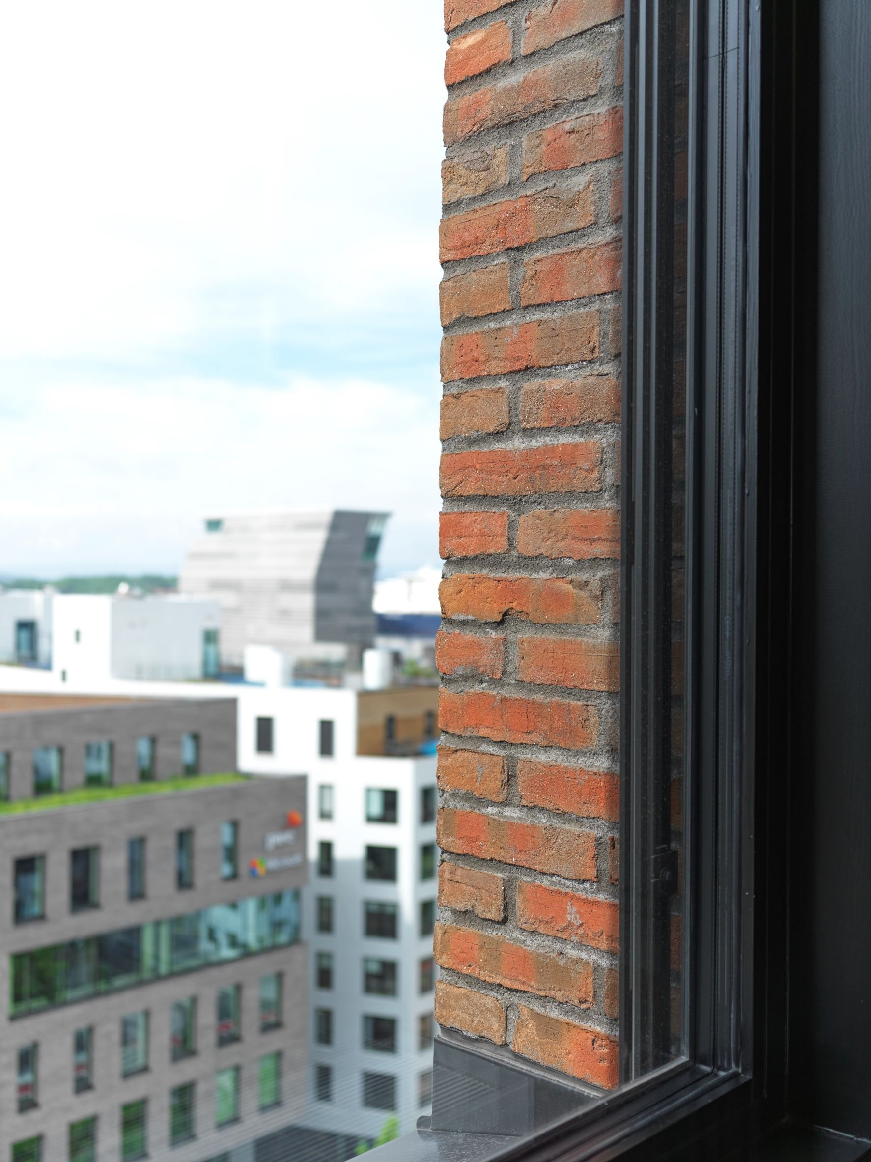
Looking at the west wall facing the rest of Barcode, certain angles will give the impression that there are no window panes. It looks as if there are only holes in the brick wall, much like the arrow slits on the roof. By retracting the windows and placing them in a brick frame without visible molding, the bricks become an active part of the interior. The original idea was to retract all of the windows in the same fashion. But on the south façade this proved difficult. If retracted, the large window panes would come in conflict with the diagonal framework.
«As a consequence we had the chance to create a special brick detail that symbolizes how far exploration of architecture can go. The task we gave ourselves was: can we make the window casing and the frame as sculptural as they did in the middle ages, only waterproofed using current technology? The answer was to place the windows flush with the brick wall,» Geir Haaversen says.
Technically, that raised another issue. When a window is flush with a brick wall on insulated walls, a thermal bridge between the window and the uninsulated brick occurs, and this weak point must be blocked. Insulation barriers were put in to reduce the heat loss.
From a distance, the framework behind several of the large windows is visible. The same solution was used for the north wall, where a vertical window strip shoots upwards with the framework zigzagging inside it.
«It was a technical necessity that ended up creating a striking design effect,» Haaversen chuckles, remembering how much work they put in this small detail, which had been developed in collaboration with an engineering office for building physics.
A final greeting
The Wedge is standing there tall and bold, greeting everyone arriving the capital from the east. Its simplified design never ceases to impress.
«For me these meeting boxes are not just an additional generated area, they are the crown of the building! The crown of barcode! The cantilevered boxes, which cannot be overlooked by passers-by.» architect Esdichan Yesdin stresses.




Barcode
When The Wedge, the conclusion of the Barcode row, was completed in 2017, it was instantly applauded. Aerial photos revealed how the high-rises drew lines resembling an electronic barcode. Each building was different from the next — as a vibration of modern architecture. Its location in the heart of the harbor, where shapes and materials are reflected in the sea, made this high-rise row a symbol of a city in growth.


